React Package Examples
Complete examples demonstrating how to use the Page Builder React package with custom components, dynamic attributes, and state management.
Basic Setup
Installation
npm install @mindfiredigital/page-builder-react
Simple Configuration
The most basic setup with built-in components:
import { PageBuilderReact } from '@mindfiredigital/page-builder-react';

const App = () => {
  const dynamicComponents = {
    Basic: [
      { name: 'button' },
      { name: 'header' },
      { name: 'text' },
      { name: 'table' },
    ],
    Extra: ['landingpage'],
  };

  return (
    <div>
      <PageBuilderReact config={dynamicComponents} />
    </div>
  );
};

export default App;
Dynamic Attributes Example
Using Input and Formula Attributes
This example demonstrates how to use dynamic attributes with calculations:
Step 1: Define the Global Execution Function
// utils/executeFormula.ts
/**
 * The global execution function that calculates formula attributes.
 * Keys in inputValues match the 'key' properties of Input and Constant attributes.
 *
 * @param {object} inputValues - Object with keys like 'input-a-key', 'input-b-key'
 * @returns {object} Object with keys matching Formula attribute keys
 */
export const localExecuteFunction = (inputValues: Record<string, any>) => {
  const A = Number(inputValues['input-a-key']) || 0;
  const B = Number(inputValues['input-b-key']) || 0;

  const sumResult = A + B;
  const productResult = A * B;

  return {
    'formula-sum-key': sumResult,
    'formula-product-key': productResult,
  };
};
Step 2: Define Component Attributes
// App.tsx
import { PageBuilderReact, ComponentAttribute } from '@mindfiredigital/page-builder-react';
import { localExecuteFunction } from './utils/executeFormula';

const App = () => {
  const dynamicAttributes: ComponentAttribute[] = [
    // Input attributes
    {
      id: 'input-a',
      type: 'Input',
      input_type: 'number',
      title: 'Input A',
      value: 10,
      default_value: 10,
      key: 'input-a-key',
      execute_order: 1,
      editable: true,
    },
    {
      id: 'input-b',
      type: 'Input',
      input_type: 'number',
      title: 'Input B',
      value: 5,
      default_value: 5,
      key: 'input-b-key',
      execute_order: 2,
      editable: true,
    },

    // Formula attributes
    {
      id: 'formula-sum',
      type: 'Formula',
      input_type: 'number',
      title: 'Total Sum',
      value: '{Input A} + {Input B}',
      default_value: 0,
      key: 'formula-sum-key',
      execute_order: 3,
    },
    {
      id: 'formula-product',
      type: 'Formula',
      input_type: 'number',
      title: 'Total Product',
      value: '{Input A} * {Input B}',
      default_value: 1,
      key: 'formula-product-key',
      execute_order: 4,
    },
  ];

  const dynamicComponents = {
    Basic: [
      { name: 'button' },
      {
        name: 'header',
        attributes: dynamicAttributes,
        globalExecuteFunction: localExecuteFunction
      },
      {
        name: 'text',
        attributes: dynamicAttributes,
        globalExecuteFunction: localExecuteFunction
      },
      {
        name: 'table',
        attributes: dynamicAttributes,
        globalExecuteFunction: localExecuteFunction
      },
    ],
    Extra: ['landingpage'],
  };

  return (
    <div>
      <PageBuilderReact config={dynamicComponents} />
    </div>
  );
};

export default App;
Custom Components Example
Creating a Custom Color Picker Component
Step 1: Build the Color Picker Component
// components/ColorPicker.tsx
import React, { forwardRef } from 'react';

interface ColorPickerProps {
  componentId?: string;
  color?: string;
}

const ColorPicker = forwardRef<HTMLDivElement, ColorPickerProps>(
  (props, forwardedRef) => {
    const { componentId, color = '#FF5733' } = props;

    return (
      <div
        ref={forwardedRef}
        style={{
          display: 'flex',
          flexDirection: 'column',
          alignItems: 'center',
          justifyContent: 'center',
          width: '200px',
          height: '150px',
          border: '2px solid #ccc',
          borderRadius: '8px',
          backgroundColor: '#f9f9f9',
          padding: '16px',
        }}
      >
        <label htmlFor="color-input" style={{ marginBottom: '12px', fontWeight: 600 }}>
          Select Color:
        </label>
        <input
          id="color-input"
          type="color"
          defaultValue={color}
          style={{
            width: '100px',
            height: '50px',
            border: 'none',
            borderRadius: '4px',
            cursor: 'pointer',
          }}
        />
        <p style={{ marginTop: '12px', fontSize: '0.875rem', color: '#666' }}>
          Current: {color}
        </p>
      </div>
    );
  }
);

ColorPicker.displayName = 'ColorPicker';
export default ColorPicker;
Step 2: Create Settings Panel for Color Picker
// settings/ColorPickerSettings.tsx
import React, { forwardRef } from 'react';
import { Box, Button, Typography } from '@mui/material';

interface ColorPickerSettingsProps {
  targetComponentId: string;
}

const ColorPickerSettings = forwardRef<unknown, ColorPickerSettingsProps>(
  (props, forwardedRef) => {
    const { targetComponentId } = props;

    const handleRandomColor = () => {
      const randomColor = '#' + Math.floor(Math.random() * 16777215).toString  };

    return (
      <Box
        ref={forwardedRef}
        sx={{
          p: 2,
          border: '1px solid #e0e0e0',
          borderRadius: '4px',
          mt: 2,
          display: 'flex',
          flexDirection: 'column',
          gap: 1,
        }}
      >
        <Typography variant="h6" sx={{ mb: 1, fontSize: '1rem' }}>
          Color Picker Settings
        </Typography>
        <Button
          variant="outlined"
          color="primary"
          onClick={handleRandomColor}
          sx={{ textTransform: 'none' }}
        >
          Generate Random Color
        </Button>
      </Box>
    );
  }
);

export default ColorPickerSettings;
Creating a Custom Rating Component
Step 1: Set Up State Management with Zustand
// store/RatingStore.ts
import { create } from 'zustand';

interface RatingState {
  ratings: Record<string, number | null>;
  resetRating: (componentId: string) => void;
  setRatingToMax: (componentId: string) => void;
  incrementRating: (componentId: string) => void;
  decrementRating: (componentId: string) => void;
  setValue: (componentId: string, value: number | null) => void;
  getRating: (componentId: string) => number | null;
}

export const useRatingStore = create<RatingState>((set, get) => ({
  ratings: {},

  resetRating: (componentId: string) => {
    set(state => ({
      ratings: { ...state.ratings, [componentId]: 0 },
    }));
  },

  setRatingToMax: (componentId: string) => {
    set(state => ({
      ratings: { ...state.ratings, [componentId]: 5 },
    }));
  },

  incrementRating: (componentId: string) => {
    const current = get().ratings[componentId] ?? 2;
    const newValue = Math.min(current + 1, 5);
    set(state => ({
      ratings: { ...state.ratings, [componentId]: newValue },
    }));
  },

  decrementRating: (componentId: string) => {
    const current = get().ratings[componentId] ?? 2;
    const newValue = Math.max(current - 1, 0);
    set(state => ({
      ratings: { ...state.ratings, [componentId]: newValue },
    }));
  },

  setValue: (componentId: string, value: number | null) => {
    set(state => ({
      ratings: { ...state.ratings, [componentId]: value },
    }));
  },

  getRating: (componentId: string) => {
    return get().ratings[componentId] ?? 2;
  },
}));
Step 2: Build the Rating Component
// components/CustomRating.tsx
import React, { forwardRef } from 'react';
import { Box, Rating, Typography } from '@mui/material';
import { useRatingStore } from '../store/RatingStore';

interface CustomRatingProps {
  componentId?: string;
}

const CustomRating = forwardRef<HTMLDivElement, CustomRatingProps>(
  (props, forwardedRef) => {
    const { componentId } = props;
    const currentComponentId = componentId || 'default';

    const value = useRatingStore(state => state.getRating(currentComponentId));
    const setValue = useRatingStore(state => state.setValue);
    const maxValue = 5;

    const handleChange = (
      event: React.SyntheticEvent<Element, Event>,
      newValue: number | null
    ) => {
      setValue(currentComponentId, newValue);
    };

    return (
      <Box
        ref={forwardedRef}
        sx={{
          display: 'flex',
          flexDirection: 'column',
          alignItems: 'center',
          justifyContent: 'center',
          width: '200px',
          height: '100px',
          border: '2px dashed #94a3b8',
          borderRadius: '8px',
          backgroundColor: '#f1f5f9',
          fontFamily: 'sans-serif',
          fontSize: '14px',
          color: '#64748b',
          margin: '10px',
          padding: '5px',
        }}
      >
        <Typography component="legend">Controlled Rating</Typography>
        <Rating
          name="simple-controlled"
          value={value}
          max={maxValue}
          onChange={handleChange}
        />
        <Typography variant="body2">
          Current Value: {value !== null ? value : 'N/A'}
        </Typography>
      </Box>
    );
  }
);

CustomRating.displayName = 'CustomRating';
export default CustomRating;
Step 3: Create Rating Settings Panel
// settings/CustomRatingSettings.tsx
import React, { forwardRef } from 'react';
import { Box, Button, Typography } from '@mui/material';
import { useRatingStore } from '../store/RatingStore';

interface CustomRatingSettingsProps {
  targetComponentId: string;
}

const CustomRatingSettings = forwardRef<unknown, CustomRatingSettingsProps>(
  (props, forwardedRef) => {
    const { targetComponentId } = props;

    const resetRating = useRatingStore(state => state.resetRating);
    const setRatingToMax = useRatingStore(state => state.setRatingToMax);
    const incrementRating = useRatingStore(state => state.incrementRating);
    const decrementRating = useRatingStore(state => state.decrementRating);

    return (
      <Box
        ref={forwardedRef}
        sx={{
          p: 2,
          border: '1px solid #e0e0e0',
          borderRadius: '4px',
          mt: 2,
          display: 'flex',
          flexDirection: 'column',
          gap: 1,
        }}
      >
        <Typography variant="h6" component="h3" sx={{ mb: 1, fontSize: '1rem' }}>
          Rating Controls
        </Typography>
        <Button
          variant="outlined"
          color="primary"
          onClick={() => resetRating(targetComponentId)}
          sx={{ textTransform: 'none', borderRadius: '8px' }}
        >
          Reset Rating
        </Button>
        <Button
          variant="outlined"
          color="primary"
          onClick={() => setRatingToMax(targetComponentId)}
          sx={{ textTransform: 'none', borderRadius: '8px' }}
        >
          Set Max Rating
        </Button>
        <Button
          variant="outlined"
          color="primary"
          onClick={() => incrementRating(targetComponentId)}
          sx={{ textTransform: 'none', borderRadius: '8px' }}
        >
          Increment Rating
        </Button>
        <Button
          variant="outlined"
          color="primary"
          onClick={() => decrementRating(targetComponentId)}
          sx={{ textTransform: 'none', borderRadius: '8px' }}
        >
          Decrement Rating
        </Button>
      </Box>
    );
  }
);

export default CustomRatingSettings;
Creating a Custom Landing Page Component
The Landing Page component demonstrates how to build a fully-featured, responsive component with embedded styles and complex layouts:
// components/LandingPage.tsx
import React, { useState, forwardRef, Ref, useEffect } from 'react';

interface LandingPageProps {
  componentId?: string;
}

const LandingPage = forwardRef<HTMLDivElement, LandingPageProps>(
  (props, forwardedRef) => {
    const [isMobile, setIsMobile] = useState<boolean>(false);
    const [isMobileMenuOpen, setIsMobileMenuOpen] = useState<boolean>(false);

    useEffect(() => {
      const checkMobile = () => {
        setIsMobile(window.innerWidth < 960);
      };
      checkMobile();
      window.addEventListener('resize', checkMobile);
      return () => window.removeEventListener('resize', checkMobile);
    }, []);

    const toggleDrawer = (open: boolean) => (
      event: React.KeyboardEvent | React.MouseEvent
    ): void => {
      if (
        event.type === 'keydown' &&
        ((event as React.KeyboardEvent).key === 'Tab' ||
          (event as React.KeyboardEvent).key === 'Shift')
      ) {
        return;
      }
      setIsMobileMenuOpen(open);
    };

    const navItems = [
      { name: 'Features', href: '#features' },
      { name: 'Pricing', href: '#pricing' },
      { name: 'About', href: '#about' },
      { name: 'Contact', href: '#contact' },
    ];

    return (
      <div ref={forwardedRef} className="lp-body">
        <style>
          {`
            @import url('https://fonts.googleapis.com/css2?family=Inter:wght@400;600;700;800&display=swap');
            * { box-sizing: border-box; margin: 0; padding: 0; }
            html { scroll-behavior: smooth; }
            .lp-body {
              font-family: 'Inter', sans-serif;
              min-height: 100vh;
              background: linear-gradient(to bottom right, #F3E5F5, #FFFFFF 50%, #E3F2FD);
              color: #212121;
            }
            .lp-container {
              max-width: 1280px;
              margin: 0 auto;
              padding: 0 16px;
            }
            .lp-navbar {
              position: sticky;
              top: 0;
              z-index: 1000;
              background-color: rgba(255, 255, 255, 0.8);
              backdrop-filter: blur(10px);
              box-shadow: 0 0 10px rgba(0,0,0,0.1);
            }
            .lp-navbar-content {
              display: flex;
              justify-content: space-between;
              align-items: center;
              height: 64px;
            }
            .lp-logo {
              width: 40px;
              height: 40px;
              background: linear-gradient(to bottom right, #9C27B0, #2196F3);
              border-radius: 8px;
              display: flex;
              align-items: center;
              justify-content: center;
              color: white;
              font-weight: bold;
              font-size: 1.25rem;
            }
            .lp-nav { display: flex; align-items: center; gap: 16px; }
            .lp-nav a { text-decoration: none; color: #757575; }
            .lp-button {
              border: none;
              cursor: pointer;
              padding: 12px 32px;
              border-radius: 8px;
              font-weight: 600;
              transition: all 0.3s;
            }
            .lp-gradient-button {
              background: linear-gradient(45deg, #9C27B0 30%, #2196F3 90%);
              color: white;
            }
            .lp-gradient-button:hover {
              transform: scale(1.05);
              box-shadow: 0 6px 10px rgba(156, 39, 176, 0.5);
            }
            .lp-outlined-button {
              background: transparent;
              color: #9C27B0;
              border: 2px solid #9C27B0;
            }
            .lp-hero {
              padding: 120px 0;
              text-align: center;
              position: relative;
              overflow: hidden;
            }
            .lp-hero-title {
              font-size: 4rem;
              font-weight: 800;
              margin-bottom: 24px;
              background: linear-gradient(to right, #9C27B0, #2196F3);
              -webkit-background-clip: text;
              -webkit-text-fill-color: transparent;
            }
            .lp-hero-subtitle {
              font-size: 1.25rem;
              color: #616161;
              margin-bottom: 40px;
            }
            .lp-cta-buttons {
              display: flex;
              gap: 16px;
              justify-content: center;
            }
            .lp-features {
              padding: 80px 0;
              background: white;
            }
            .lp-features-grid {
              display: grid;
              grid-template-columns: repeat(auto-fit, minmax(250px, 1fr));
              gap: 24px;
              margin-top: 48px;
            }
            .lp-feature-card {
              padding: 24px;
              border-radius: 8px;
              background: linear-gradient(to bottom right, #F3E5F5, #E3F2FD);
              transition: transform 0.3s;
            }
            .lp-feature-card:hover {
              transform: scale(1.03);
            }
            @media (max-width: 960px) {
              .lp-hero { padding: 80px 0; }
              .lp-hero-title { font-size: 2.5rem; }
              .lp-cta-buttons { flex-direction: column; }
              .lp-nav { display: none; }
            }
          `}
        </style>

        {/* Navigation */}
        <header className="lp-navbar">
          <div className="lp-container">
            <div className="lp-navbar-content">
              <div className="lp-logo">PB</div>
              {!isMobile && (
                <nav className="lp-nav">
                  {navItems.map((item) => (
                    <a key={item.name} href={item.href}>
                      {item.name}
                    </a>
                  ))}
                  <button className="lp-button lp-gradient-button">
                    Sign In
                  </button>
                </nav>
              )}
            </div>
          </div>
        </header>

        {/* Hero Section */}
        <section className="lp-hero">
          <div className="lp-container">
            <h1 className="lp-hero-title">Build Amazing Web Experiences</h1>
            <p className="lp-hero-subtitle">
              Create stunning, responsive pages with our drag-and-drop builder
            </p>
            <div className="lp-cta-buttons">
              <button className="lp-button lp-gradient-button">
                Get Started Free
              </button>
              <button className="lp-button lp-outlined-button">
                Watch Demo
              </button>
            </div>
          </div>
        </section>

        {/* Features Section */}
        <section className="lp-features">
          <div className="lp-container">
            <h2 style={{ textAlign: 'center', fontSize: '2rem', marginBottom: 12 }}>
              Powerful Features
            </h2>
            <p style={{ textAlign: 'center', color: '#616161', marginBottom: 48 }}>
              Everything you need to create amazing web experiences
            </p>
            <div className="lp-features-grid">
              {[
                {
                  title: 'Lightning Fast',
                  description: 'Optimized performance for instant loading',
                },
                {
                  title: 'Collaborative',
                  description: 'Work together with your team in real-time',
                },
                {
                  title: 'Easy to Use',
                  description: 'Intuitive interface anyone can master',
                },
                {
                  title: 'Premium Quality',
                  description: 'Professional results every time',
                },
              ].map((feature) => (
                <div key={feature.title} className="lp-feature-card">
                  <h3 style={{ marginBottom: 8 }}>{feature.title}</h3>
                  <p style={{ color: '#616161' }}>{feature.description}</p>
                </div>
              ))}
            </div>
          </div>
        </section>
      </div>
    );
  }
);

LandingPage.displayName = 'LandingPage';
export default LandingPage;
Key Features of the Landing Page Component:
- Responsive Design: Adapts seamlessly to mobile and desktop viewports
- Embedded Styles: CSS is scoped within the component for better encapsulation
- Dynamic State: Tracks mobile view state and manages menu interactions
- Real-world Layout: Demonstrates navigation, hero section, features grid
- Forward Ref: Properly forwards ref for integration with Page Builder
Complete Integration Example
Here's a complete app setup with all custom components integrated, including the Landing Page component:
// App.tsx
import { PageBuilderReact, ComponentAttribute } from '@mindfiredigital/page-builder-react';
import ColorPicker from './components/ColorPicker';
import CustomRating from './components/CustomRating';
import CustomRatingSettings from './settings/CustomRatingSettings';
import Image from './components/Image';
import LandingPage from './components/LandingPage';
import { localExecuteFunction } from './utils/executeFormula';
import './App.css';

const App = () => {
  // Define dynamic attributes for calculations
  const dynamicAttributes: ComponentAttribute[] = [
    {
      id: 'input-a',
      type: 'Input',
      input_type: 'number',
      title: 'Input A',
      value: 10,
      key: 'input-a-key',
      execute_order: 1,
      editable: true,
      default_value: 10,
    },
    {
      id: 'input-b',
      type: 'Input',
      input_type: 'number',
      title: 'Input B',
      value: 5,
      key: 'input-b-key',
      execute_order: 2,
      editable: true,
      default_value: 5,
    },
    {
      id: 'formula-sum',
      type: 'Formula',
      title: 'Total Sum',
      value: '{Input A} + {Input B}',
      key: 'formula-sum-key',
      execute_order: 3,
    },
    {
      id: 'formula-product',
      type: 'Formula',
      title: 'Total Product',
      value: '{Input A} * {Input B}',
      key: 'formula-product-key',
      execute_order: 4,
    },
  ];

  // Configure built-in components with attributes
  const dynamicComponents = {
    Basic: [
      { name: 'button' },
      {
        name: 'header',
        attributes: dynamicAttributes,
        globalExecuteFunction: localExecuteFunction
      },
      {
        name: 'text',
        attributes: dynamicAttributes,
        globalExecuteFunction: localExecuteFunction
      },
      {
        name: 'table',
        attributes: dynamicAttributes,
        globalExecuteFunction: localExecuteFunction
      },
    ],
    Extra: ['landingpage'],
  };

  // Register all custom components
  const customComponents = {
    ColorPicker: {
      component: ColorPicker,
      svg: `<svg width="24" height="24" viewBox="0 0 16 16" fill="none" xmlns="http://www.w3.org/2000/svg">
        <path d="M8 16L3.54 12.34C1.93 11.02 1 9.04 1 6.96C1 3.12 4.16 0 8 0C11.84 0 15 3.12 15 6.96C15 9.04 14.07 11.02 12.46 12.34L8 16Z" fill="currentColor"/>
      </svg>`,
      title: 'Color Picker Component',
    },
    CustomRating: {
      component: CustomRating,
      svg: `<svg width="24" height="24" viewBox="0 0 24 24" fill="currentColor" xmlns="http://www.w3.org/2000/svg">
        <polygon points="12 2 15.09 8.26 22 9.27 17 14.14 18.18 21.02 12 17.77 5.82 21.02 7 14.14 2 9.27 8.91 8.26 12 2"/>
      </svg>`,
      title: 'Custom Rating Component',
      settingsComponent: CustomRatingSettings,
    },
    Image: {
      component: Image,
      svg: `<svg width="24" height="24" viewBox="0 0 24 24" fill="none" xmlns="http://www.w3.org/2000/svg">
        <rect x="3" y="3" width="18" height="18" stroke="currentColor" stroke-width="2"/>
        <path d="M3 16L8 11L13 16L21 8" stroke="currentColor" stroke-width="2"/>
      </svg>`,
      title: 'Image Component',
    },
    LandingPage: {
      component: LandingPage,
      svg: `<svg width="24" height="24" viewBox="0 0 24 24" fill="none" xmlns="http://www.w3.org/2000/svg">
        <rect x="3" y="3" width="18" height="18" stroke="currentColor" stroke-width="2"/>
        <line x1="3" y1="9" x2="21" y2="9" stroke="currentColor" stroke-width="2"/>
        <line x1="9" y1="21" x2="9" y2="9" stroke="currentColor" stroke-width="2"/>
      </svg>`,
      title: 'Landing Page',
    },
  };

  return (
    <div>
      <PageBuilderReact
        config={dynamicComponents}
        customComponents={customComponents}
      />
    </div>
  );
};

export default App;
What This Example Demonstrates:
- Dynamic Attributes: Two input fields (Input A, Input B) that calculate sum and product in real-time
- Multiple Custom Components: Color Picker, Rating (with state management), Image, and Landing Page
- Settings Panels: Rating component includes a dedicated settings panel for user controls
- SVG Icons: Custom icons for each component in the sidebar
- Responsive Design: Landing Page component adapts to different screen sizes
- Real-world Integration: Shows how to tie everything together in a production-ready application
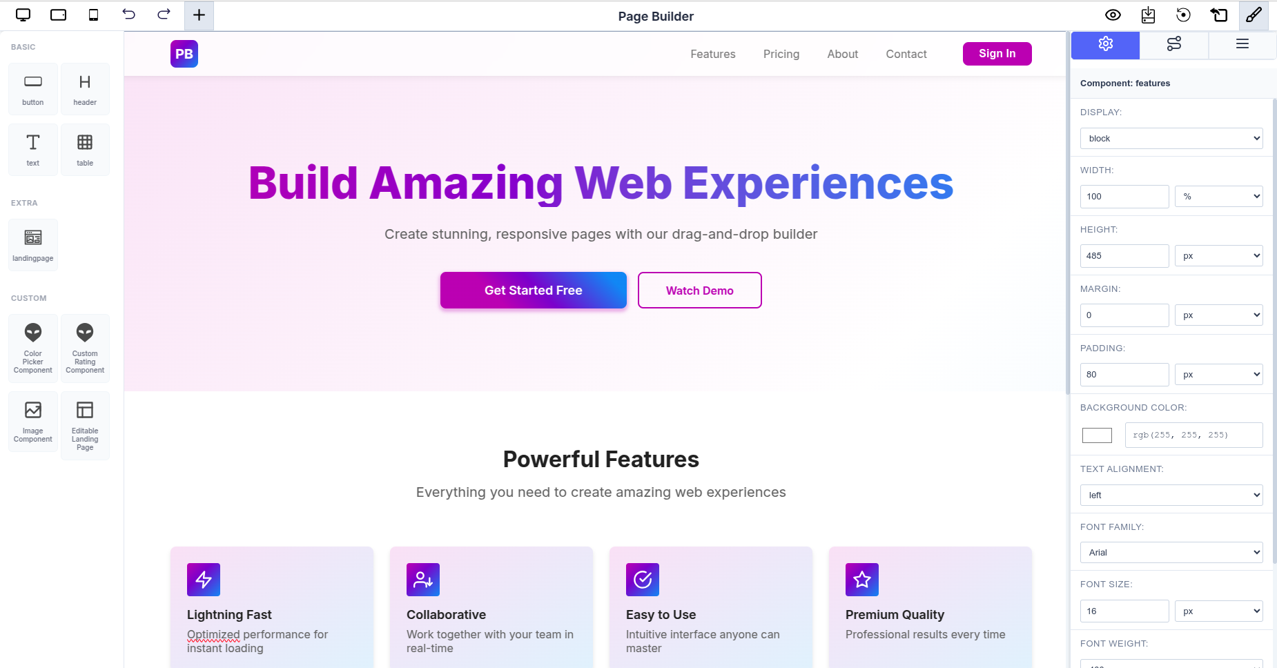
Visual Example:
The Page Builder with these components looks like this in practice:
 Full Page Builder interface showing the Landing Page component with drag-and-drop editor and attribute controls
On the left sidebar, you'll see all custom components (Color Picker, Custom Rating, Image, Landing Page) ready to be dragged onto the canvas. The Landing Page component renders a complete landing page template that can be further customized through the Page Builder's visual editor.
Best Practices
Component Design
- Always use forwardRef: Custom components should accept and forward refs to the DOM element
- Provide displayName: Set
displayNameon forwardRef components for better debugging - Use Optional Props: Design components with flexible, optional props for reusability
- Consistent Styling: Use a CSS module or styled-components for maintainable styling
State Management
- Use Zustand for Cross-Component State: When multiple component instances need shared state, use Zustand stores
- Namespace State by Component ID: Use unique component IDs as keys to isolate state between instances
- Keep State Minimal: Only store essential state; derive other values when possible
Performance
- Memoize Components: Use
React.memofor custom components to prevent unnecessary re-renders - Lazy Load Complex Components: Consider code splitting for heavyweight custom components
- Optimize Execution Functions: Keep
globalExecuteFunctionlogic efficient to avoid performance degradation
Accessibility
- Use Semantic HTML: Prefer semantic elements over divs
- Add ARIA Labels: Include
aria-labeland other ARIA attributes for screen readers - Keyboard Navigation: Ensure all interactive elements are keyboard accessible
- Color Contrast: Maintain sufficient color contrast for readability
Troubleshooting
Custom Component Not Showing
- Ensure component is properly exported
- Verify
customComponentsobject is passed toPageBuilderReact - Check that component SVG is valid
State Not Persisting
- Verify Zustand store is properly initialized
- Check that component IDs are unique
- Ensure setter functions are called correctly
Formula Not Calculating
- Verify
globalExecuteFunctionis passed to component config - Check that input
keymatches the function parameter keys - Ensure formula return object keys match attribute
keyproperties - Add console logging to debug calculation flow