View Mode (Read-Only)
The Page Builder supports a dedicated View Mode, which permanently disables all editing capabilities for published designs. This mode is distinct from the Preview Mode button, which temporarily shows how a design looks during the creation process.
Overview
View Mode vs Preview Mode:
| Feature | Preview Mode | View Mode |
|---|---|---|
| Purpose | Temporary preview during design creation | Permanent read-only state after publishing |
| Access | Available via Preview button in editor | Enabled programmatically via props |
| Use Case | Designer checks their work in progress | Published design locked for end users |
| Reversible | Yes - return to edit mode anytime | Controlled by application logic |
When to Use View Mode
View Mode is designed for post-publication scenarios where you want to:
- Lock published designs to prevent unauthorized modifications
- Deploy completed pages to production environments
- Share finalized content with users who should only consume, not edit
- Archive approved designs while maintaining visibility
- Create read-only instances of templates or published content
Disabled Features in View Mode
When View Mode is active, the following actions are disabled:
- Drag & Drop: Users cannot move, add, or rearrange components
- Component Selection: Components cannot be selected on the canvas
- Styling/Settings: The Sidebar/Settings Panel is hidden or inactive
- Resizing/Interaction: Component resizing handles, editing borders, and other interactive editing controls are suppressed
The design is rendered as a clean, final output ready for presentation or embedding.
Enabling View Mode
You can enable View Mode by passing the editable prop to the PageBuilderReact component.
Basic Usage
import { PageBuilderReact } from '@mindfiredigital/page-builder-react';

const App = () => {
  return (
    <div>
      <PageBuilderReact editable={false} />
    </div>
  );
};

export default App;
Attribute Tab in View Mode
While View Mode disables editing capabilities, you can still provide access to the Attribute Tab for viewing component properties and details. This is useful when you want users to inspect component configurations without the ability to modify them.
Enabling Attribute Tab
Set the showAttributeTab prop to true along with editable={false}:
import { PageBuilderReact } from '@mindfiredigital/page-builder-react';

const App = () => {
  const dynamicComponents = {
    Basic: [
      { name: 'button' },
      { name: 'header' },
      { name: 'text' },
      { name: 'table' },
    ],
    Extra: ['landingpage'],
  };

  return (
    <div>
      <PageBuilderReact
        showAttributeTab={true}
        editable={false}
        config={dynamicComponents}
      />
    </div>
  );
};

export default App;
Attribute Tab Behavior in View Mode
When showAttributeTab={true} is set in View Mode:
- ✅ Users can view component attributes and properties
- ✅ The attribute panel displays component configurations
- ✅ Component details remain accessible for inspection
- ❌ Users cannot modify any attributes or settings
- ❌ All input fields and controls remain disabled
Props Reference
| Prop | Type | Default | Description |
|---|---|---|---|
editable | boolean | true | Controls whether the page builder is in edit mode or view mode |
showAttributeTab | boolean | false | Shows the attribute tab in view mode for inspecting component properties |
config | object | - | Configuration object for available components |
Visual Examples
View Mode With Attribute Tab
When both editable={false} and showAttributeTab={true} are set, users can access a read-only attribute panel to inspect component properties while the canvas remains non-editable.
Example: Salary Structure View
 Figure 1: View Mode displaying a salary structure table with attribute tab enabled. Users can view component details but cannot edit them.
The above example shows a professional salary breakdown for "Sagarika Rout" displayed in View Mode. Notice how:
- The canvas displays the final rendered design cleanly
- The attribute tab is accessible on the right side
- All editing controls (drag handles, resize controls, etc.) are hidden
- The design maintains its formatting and structure
View Mode Without Attribute Tab
When editable={false} and showAttributeTab is not set or false, the page displays in pure presentation mode with no sidebar or controls.
Example: Clean Canvas View
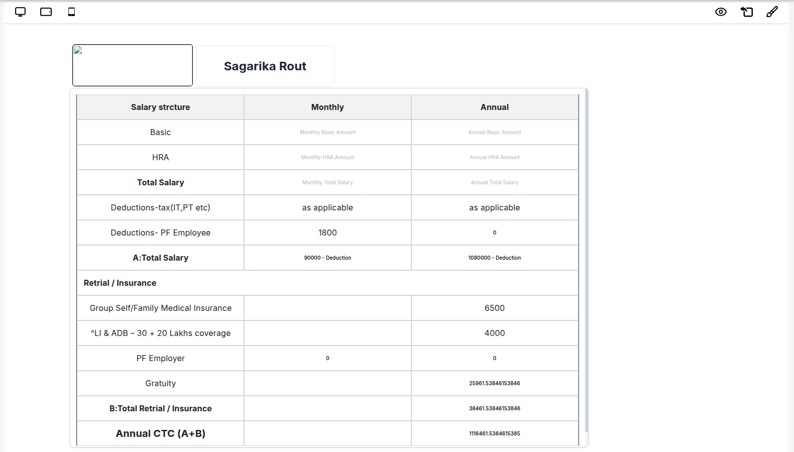 Figure 2: Pure view mode with no attribute tab - minimal, distraction-free display.
In this example:
- The canvas area is completely clean and uncluttered
- No sidebars or panels are visible
- The focus is entirely on the rendered content
- Perfect for embedding or full-screen presentations
Typical Workflow
- Design Phase: User creates and edits the design with
editable={true}(default) - Preview Phase: User uses the built-in Preview button to check the design
- Publish Phase: User completes the design and publishes it
- View Mode: Application switches to
editable={false}to lock the published design - Consumption: End users view the locked, non-editable version
Use Cases
1. Publishing System
const PublishedPage = ({ pageId, isPublished }) => {
  return <PageBuilderReact editable={!isPublished} pageId={pageId} />;
};
Scenario: A content creator designs a landing page. Once satisfied, they click "Publish". The system sets editable={false}, locking the design for all subsequent viewers.
2. Role-Based Access Control
const RoleBasedPageBuilder = ({ userRole }) => {
  const canEdit = userRole === 'admin' || userRole === 'editor';

  return (
    <PageBuilderReact
      editable={canEdit}
      showAttributeTab={userRole === 'viewer' || userRole === 'reviewer'}
    />
  );
};
Scenario: Admins and editors can modify designs, while viewers and reviewers can only inspect (with attribute tab) or view the content.
3. Template Distribution
const TemplateViewer = ({ templateId }) => {
  return (
    <PageBuilderReact
      editable={false}
      showAttributeTab={true}
      templateId={templateId}
    />
  );
};
Scenario: Distribute approved templates to users who need to see the structure and configuration but cannot modify the master template.
4. Approval Workflow
const ApprovalWorkflow = ({ designStatus }) => {
  const isApproved = designStatus === 'approved';

  return <PageBuilderReact editable={!isApproved} showAttributeTab={true} />;
};
Scenario: Designs go through an approval process. Once approved, they're locked (editable={false}) to prevent further changes while reviewers can still inspect attributes.
5. Version History
const VersionHistory = ({ version, isCurrentVersion }) => {
  return (
    <PageBuilderReact
      editable={isCurrentVersion}
      version={version}
      showAttributeTab={true}
    />
  );
};
Scenario: Users can view historical versions of a design in read-only mode, with only the current version being editable.
6. Multi-Environment Deployment
const EnvironmentBasedBuilder = () => {
  const isDevelopment = process.env.NODE_ENV === 'development';

  return (
    <PageBuilderReact
      editable={isDevelopment}
      showAttributeTab={isDevelopment}
    />
  );
};
Scenario: Development environment allows editing, while staging and production environments display locked versions.
Best Practices
- Distinguish from Preview: Remember that Preview Mode (button in editor) is for checking work during design, while View Mode is for locking published content
- Implement publish workflows: Use View Mode as part of a publishing system where designs transition from editable to locked
- Consider role-based access: Tie
editableprop to user permissions and roles - Enable Attribute Tab selectively: Use
showAttributeTab={true}when users need to inspect configurations without editing - Version control: Keep editable versions separate from published, locked versions
- Audit trail: Log when designs transition from editable to view mode (published state)
- Conditional rendering: Dynamically control
editablebased on application state, user role, or environment
Common Patterns
Pattern 1: Simple Publish Toggle
const [isPublished, setIsPublished] = useState(false);

const handlePublish = () => {
  // Save design to database
  saveDesign();
  // Lock the design
  setIsPublished(true);
};

return (
  <>
    {!isPublished && <button onClick={handlePublish}>Publish Design</button>}
    <PageBuilderReact editable={!isPublished} />
  </>
);
Pattern 2: Permission-Based Access
const { user } = useAuth();
const canEdit = user.permissions.includes('edit_designs');

return <PageBuilderReact editable={canEdit} showAttributeTab={!canEdit} />;
Pattern 3: Status-Driven Mode
const { design } = useDesign(designId);
const isEditable = design.status === 'draft';

return (
  <PageBuilderReact
    editable={isEditable}
    showAttributeTab={design.status === 'published'}
  />
);
Notes
- View Mode is not the same as Preview Mode: Preview Mode is a temporary view during design creation (accessed via button), while View Mode is a permanent locked state for published designs
- View Mode does not affect the underlying data structure; it only controls whether editing is allowed
- The
editableprop can be toggled dynamically based on your application's business logic - All component functionality remains active in View Mode; only editing controls are disabled
- Consider implementing a "Publish" workflow that transitions designs from editable to view mode
- View Mode is ideal for production environments where end users should consume content, not modify it