Drag-and-Drop Editor
The heart of the Page Builder is its intuitive Drag-and-Drop Editor, providing a real-time, WYSIWYG (What You See Is What You Get) environment. This feature simplifies the process of page creation, making it accessible to both developers and non-technical users.
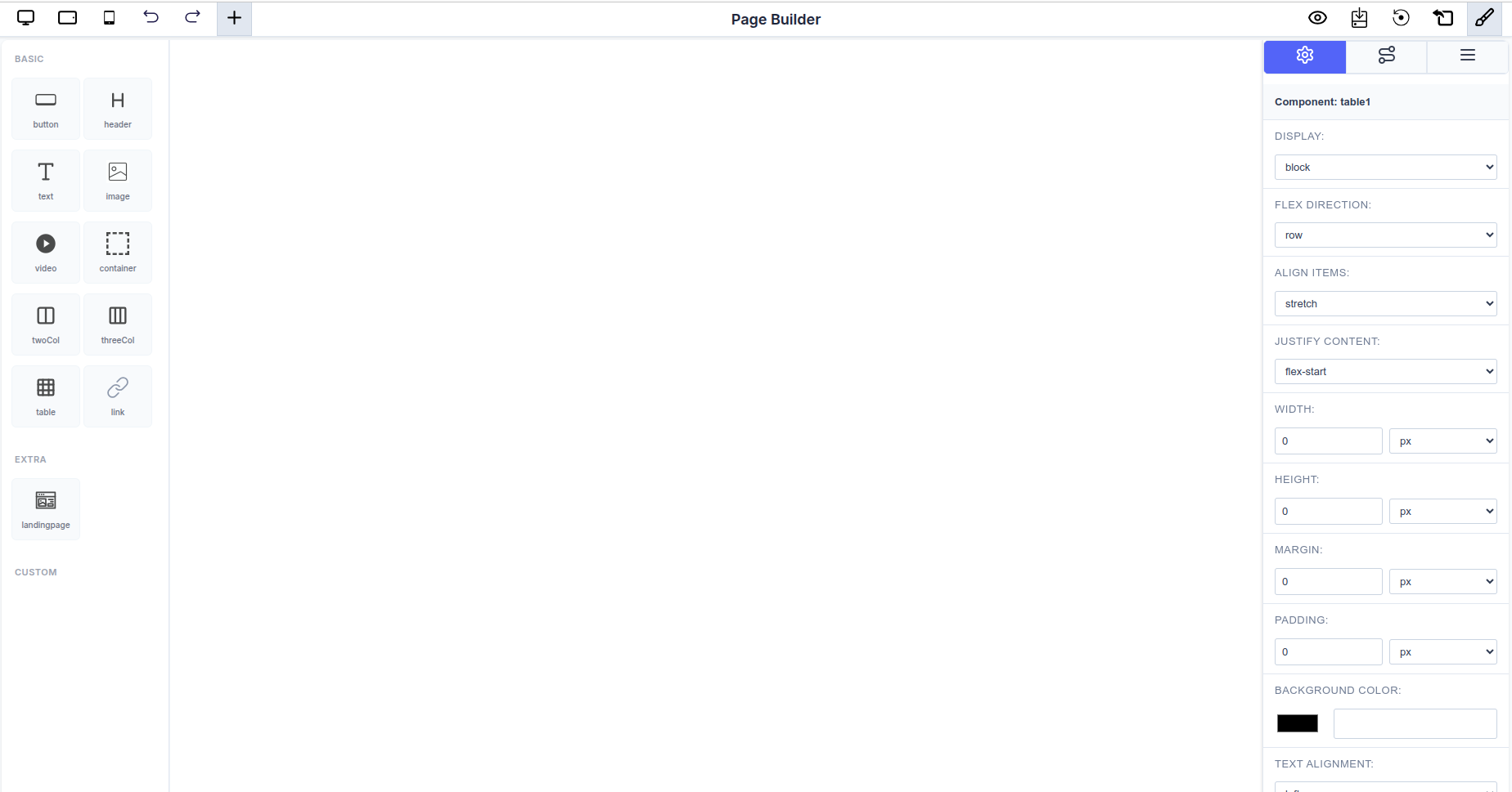 The complete Page Builder interface showing the component library (left), canvas (center), and component settings panel (right)
Interface Overview
The Page Builder consists of three main areas:
- Component Sidebar (Left): Contains draggable components organized into Basic, Extra, and Custom categories
- Canvas (Center): The main workspace where you build your page visually
- Settings Panel (Right): Detailed property controls for the selected component
Configuring Available Components
You can customize which components appear in the sidebar by passing a configuration object to the Page Builder. This allows you to control exactly which components are available to your users.
React Package Usage
import { PageBuilderReact } from '@mindfiredigital/page-builder-react';

const App = () => {
  const dynamicComponents = {
    Basic: [
      { name: 'button' },
      { name: 'header' },
      { name: 'text' },
      { name: 'table' },
    ],
    Extra: ['landingpage'],
  };

  return (
    <div>
      <PageBuilderReact
        config={dynamicComponents}
      />
    </div>
  );
};

export default App;
Seamless Component Management
The editor allows for effortless construction and manipulation of your page structure directly on the canvas.
Adding Components
- Components from the Sidebar Library (both built-in and custom components) can be dragged onto any available area of the canvas.
- Available components include:
- BASIC: Button, Header, Text, Table
- EXTRA: Landing Page
- CUSTOM: Color Picker Component, Custom Rating Component, Image
- Indicators will guide you, showing where the component can be successfully dropped into the layout hierarchy.
Arranging and Structuring
- Once placed, components can be selected and rearranged within their containers by simply clicking and dragging them to a new position.
- This allows for quick iteration and structural changes without touching the underlying code.
Real-Time Editing
- All changes—whether moving a component or modifying its properties in the Settings Panel—are reflected instantly on the canvas.
- The Settings Panel offers complete control over component properties including:
- Display mode, dimensions (width/height)
- Spacing (margin/padding)
- Background color and text alignment
- Typography (font family, size, weight)
- Provides immediate visual feedback for all modifications.
Additional Features
- Responsive Preview: Toggle between desktop, tablet, and mobile views using the icons in the top toolbar
- History Controls: Undo and redo buttons for easy navigation through changes
- Quick Actions: Access additional tools and settings via the top-right toolbar