Customization and Styling
The visual editor works in conjunction with the Sidebar's Settings Panel to provide granular control over every element. This intuitive workflow allows you to select, inspect, and customize any component on your page with precision.
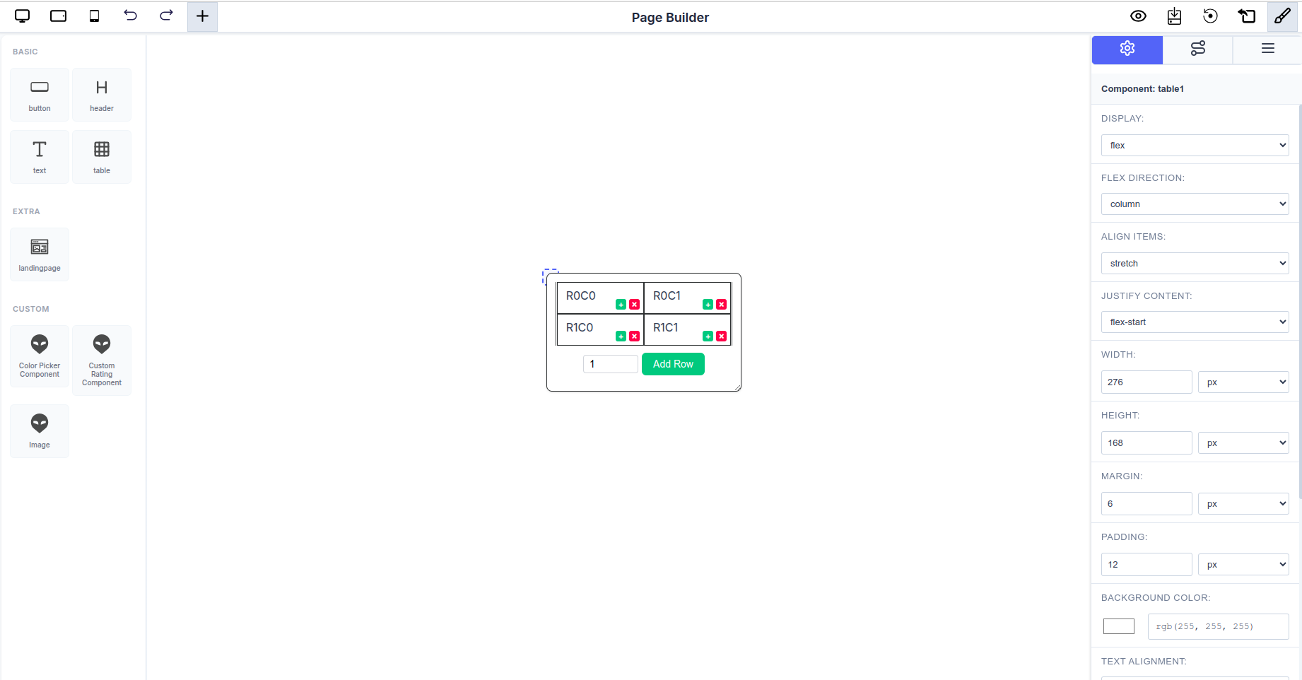 The Page Builder interface showing a selected text component with its properties displayed in the Settings Panel
Component Selection and Editing Workflow
1. Selection
- Click any component on the canvas to select it.
- The selected component will be highlighted with a visual indicator (typically a border or outline).
- You can select nested components by clicking directly on them within their parent containers.
2. Settings Panel Activation
- Upon selection, the Sidebar automatically switches to the Settings Panel.
- The panel displays all configurable properties for that specific component.
- Properties are organized into logical sections for easy navigation.
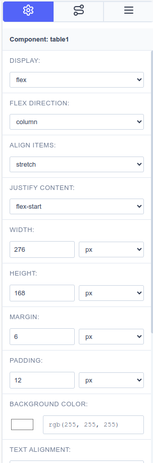 The Settings Panel showing comprehensive configuration options for a text component
3. Customization Options
Users can seamlessly customize the component's appearance, behavior, and content through the Settings Panel:
Display Properties
- Control how the component renders (block, inline-block, flex, etc.)
- Set component visibility and display modes
Dimensions
- Width: Set precise widths using multiple units (px, %, em, rem, vw, vh)
- Height: Define height with the same flexible unit options
- Supports responsive sizing for different screen sizes
Spacing
- Margin: Control outer spacing around the component
- Padding: Adjust inner spacing within the component
- Apply uniform spacing or customize individual sides
Styling
- Background Color: Choose colors using the integrated color picker
- Text Alignment: Align content left, center, right, or justify
- Borders: Configure border styles, widths, and colors
- Shadows: Add depth with box and text shadows
Typography
- Font Family: Select from available font families (Arial, Helvetica, Times New Roman, etc.)
- Font Size: Adjust text size with pixel precision
- Font Weight: Control text boldness (normal, bold, lighter, bolder, or numeric values)
- Line Height: Set spacing between lines of text
- Letter Spacing: Fine-tune character spacing
Advanced Properties
- Attributes: Configure dynamic attributes and formulas for interactive components
- Data Binding: Connect components to data sources
- Event Handlers: Set up component behaviors and interactions
- Content: Edit text, images, and other direct content inline
Real-Time Visual Feedback
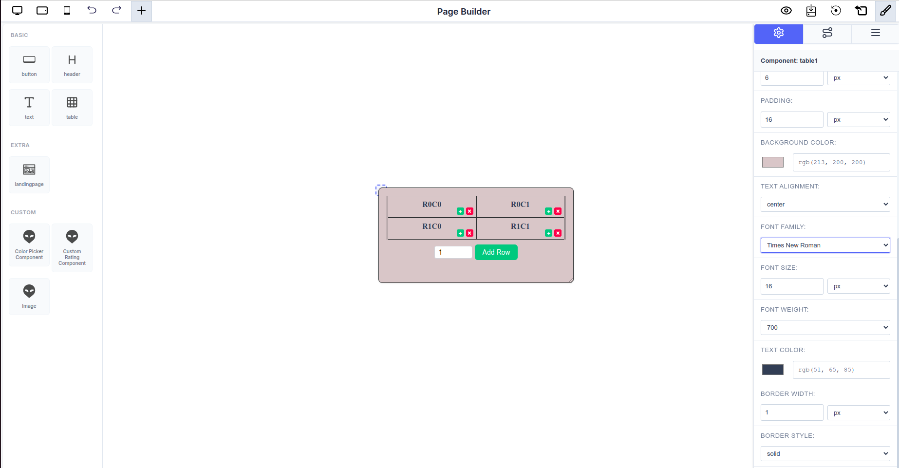 Changes made in the Settings Panel are instantly reflected on the canvas
Every modification made in the Settings Panel is immediately reflected on the canvas:
- Instant Updates: No need to save or preview—see changes as you make them
- WYSIWYG Experience: What you see in the editor is exactly what you get in the final output
- Iterative Design: Quickly experiment with different styles and configurations
- Undo/Redo Support: Easily revert changes if needed using the history controls
Example: Customizing a Text Component
Here's a typical workflow for customizing a text component:
- Select the text component on the canvas
- Settings Panel opens automatically showing:
- Display:
block - Width:
119px - Height:
50px - Margin:
6px - Padding:
0px - Background Color: RGB selector
- Text Alignment:
left - Font Family:
Arial - Font Size:
16px
- Display:
- Adjust properties as needed—each change appears instantly on the canvas
- Fine-tune until you achieve the desired look
Best Practices for Customization
Consistent Styling
- Use consistent spacing (margins and padding) across similar components
- Maintain a cohesive color palette throughout your design
- Stick to a limited set of font families for better readability
Responsive Design
- Test different width units (%, vw) for responsive layouts
- Use relative units (em, rem) for typography to scale better
- Check your design in different viewport sizes using the preview toggles
Performance Considerations
- Avoid excessive nesting of components when possible
- Use appropriate display properties for optimal rendering
- Keep custom styling organized and minimal
Accessibility
- Ensure sufficient color contrast between text and backgrounds
- Use semantic font sizes and weights
- Maintain readable line heights and letter spacing