How to customize style
Tailor the editor's user interface to align with the specific requirements of your application.
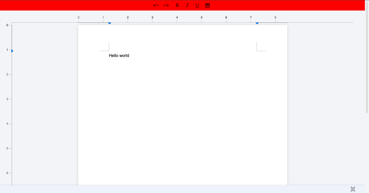
Customize toolbar style
You can adjust the style of the toolbar to meet your design needs. Create a configuration object as follows:
toolbarClass = {
  container: {
    backgroundColor: 'red',
  },
  primaryToolbar: {
    justifyContent: 'center',
  },
};
Now, integrate this style configuration into your DocumentEditor or DocumentEditorWebComponent:
Angular Component
<DocumentEditor [toolbar_class]="toolbar_class"></DocumentEditor>Web Component for React
<web-doc toolbar_class="{toolbar_class}"></web-doc>Web Component for JavaScript
<!-- In you html file add following code in a body tag where you want to use Angular canvas editor -->
<body>
  <web-doc toolbar_class="${JSON.stringify(toolbar_class)}"></web-doc>
  <script type="module" src="/main.js"></script>
</body>
// In main.js file(i.e. used as a script in html file) add the following code
toolbarClass = {
container: {
back: 'red',
},
primaryToolbar: {
justify-content : 'center',
},
};
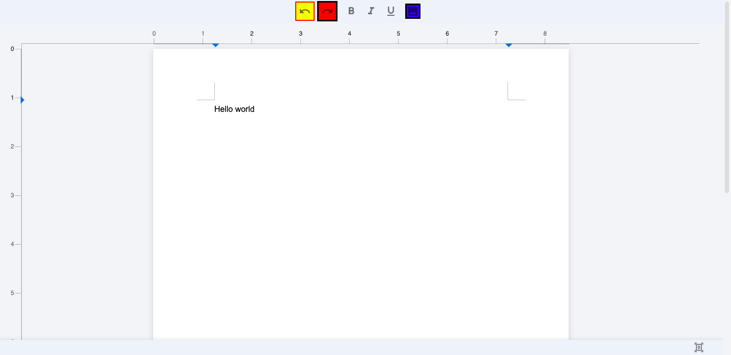
Customize toolbar components style
To fine-tune the style of individual toolbar components, define styles for items like undo, redo, and images. Here's an example configuration:
toolbarClass = {
  item: {
    undo: {
      border: 'red solid 2px',
      background: 'yellow',
    },
    redo: {
      border: 'black solid 3px',
      background: 'blue',
    },
    image: {
      border: 'black solid 3px',
      background: 'blue',
    },
  },
};
Apply these styles to your DocumentEditor or DocumentEditorWebComponent:
Angular Component
<DocumentEditor [toolbar_class]="toolbar_class"></DocumentEditor>Web Component for React
<web-doc toolbar_class="{toolbar_class}"></web-doc>Web Component for JavaScript
<!-- In you html file add following code in a body tag where you want to use Angular canvas editor -->
<body>
  <web-doc toolbar_class="${JSON.stringify(toolbar_class)}"></web-doc>
  <script type="module" src="/main.js"></script>
</body>
;
Customize toolbar selected components color
You can also customize the color of selected toolbar components. Here's an example configuration:
toolbarClass = {
  item: {
    selectedToolbarItemColor: {
      color: '#1a73e8',
    },
  },
};
Apply these styles to your DocumentEditor or DocumentEditorWebComponent:
Angular Component
<DocumentEditor [toolbar_class]="toolbarClass" />;Web Component for React
<web-doc toolbar_class="{toolbar_class}"></web-doc>Web Component for JavaScript
<!-- In you html file add following code in a body tag where you want to use Angular canvas editor -->
<web-doc toolbar_class="${JSON.stringify(toolbar_class)}"></web-doc>
;
// In main.js file(i.e. used as a script in html file) add the following code
import '@mindfiredigital/angular-canvas-editor';
import '@angular/compiler';
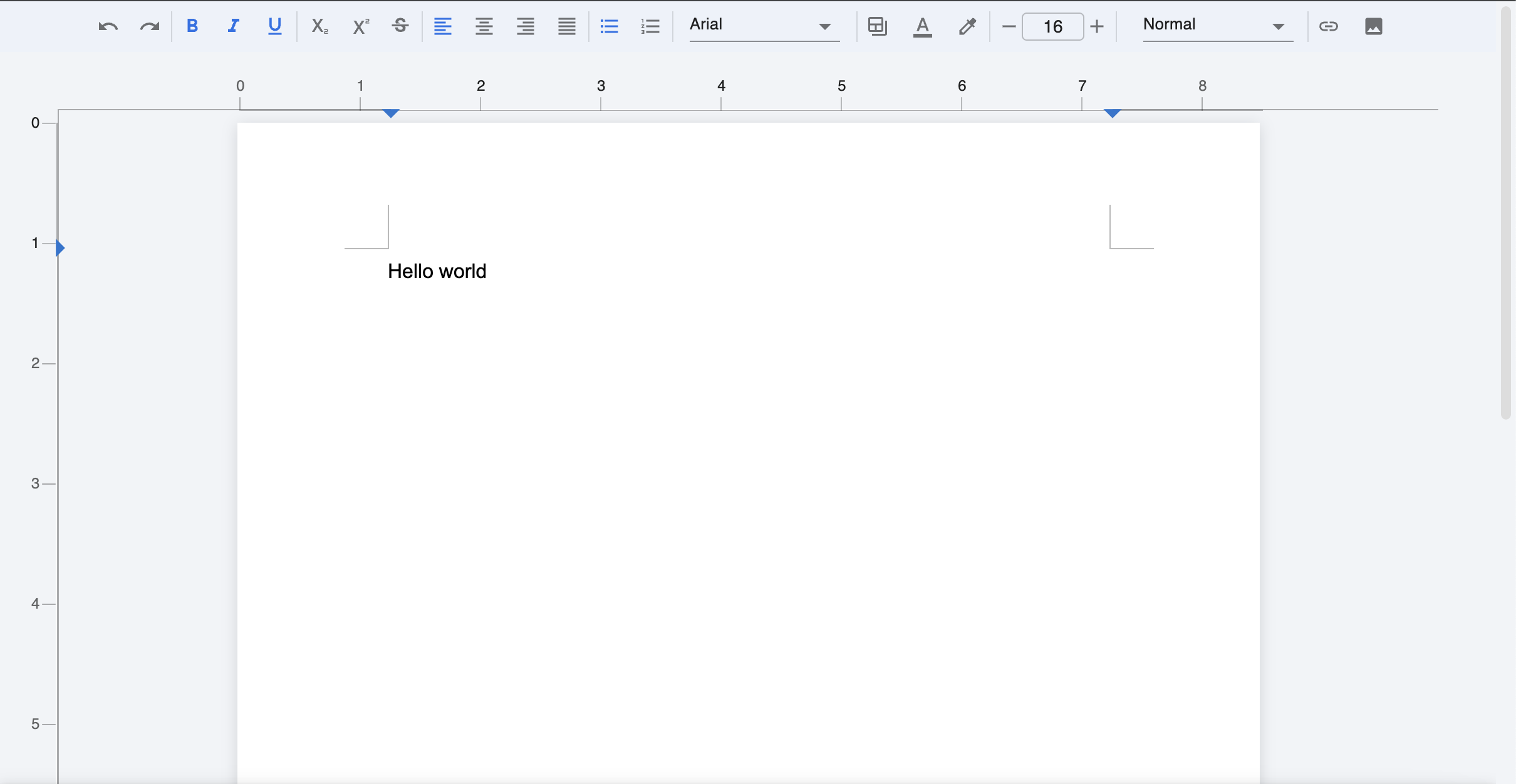
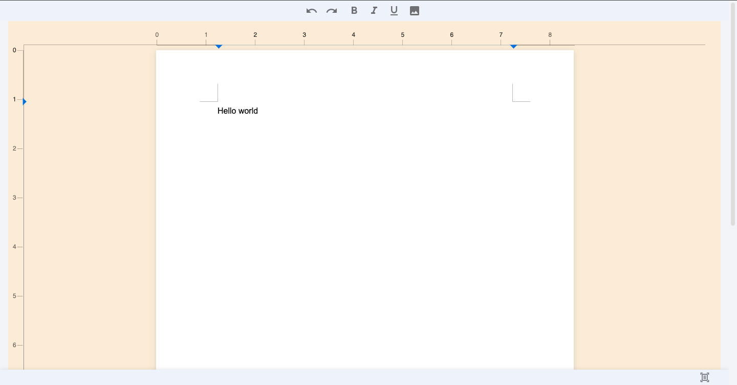
Customize editor page
You can also customize the appearance of the editor page. Define the styles for the editor main and margin areas:
canvasClass = {
  editorMain: {
    background: 'antiquewhite',
  },
  margin: {},
};
Incorporate these styles into your DocumentEditor or DocumentEditorWebComponent:
Angular Component
<DocumentEditor [canvas_class]="canvas_class"></DocumentEditor>Web Component for React
<web-doc canvas_class="${JSON.stringify(canvas_class)}"></web-doc>Web Component for JavaScript
<!-- In you html file add following code in a body tag where you want to use Angular canvas editor -->
<body>
  <web-doc canvas_class="${JSON.stringify(canvas_class)}"></web-doc>
  <script type="module" src="/main.js"></script>
</body>
;
// In main.js file(i.e. used as a script in html file) add the following code
import '@mindfiredigital/angular-canvas-editor';
import '@angular/compiler';
By following these steps, you can professionally customize the style of your editor to align with your application's requirements.