Error Page
The ErrorPage component provides a fully customizable, composable error page interface designed for modern web applications. It includes error code display with animations, customizable illustrations, search functionality, navigation links, and multiple visual variants.
- Preview
- Code
404
Page Not Found
The page you're looking for doesn't exist. It might have been moved, deleted, or the URL might be incorrect.
import {
    ErrorPage,
    ErrorPageErrorCode,
    ErrorPageHeading,
    ErrorPageDesc,
    ErrorPageIllustration,
    ErrorPageContent,
    ErrorPageSearch,
    ErrorPageFooter,
    ErrorPageLinks,
    ErrorPageIcons,
    ErrorPageErrorReference,
  } from '@ignix-ui/errorpage';
import { ButtonWithIcon } from '@ignix-ui/buttonwithicon';
import { Home, ArrowLeft, RefreshCw, Bug, MessageCircle, AlertTriangle, Wrench, Zap, Rocket, Settings, ShieldAlert } from 'lucide-react';

const handleCopyReferenceId = (referenceId: string) => {
  navigator.clipboard?.writeText(referenceId);
};

<ErrorPage
  variant="default"
  icon={Settings}
>
  <ErrorPageContent>
    <ErrorPageIcons
      icons={[AlertTriangle, Wrench, Zap, Rocket]}
    >
      <ErrorPageErrorCode
        errorCode="404"
        animationType="none"
      />
    </ErrorPageIcons>
    <ErrorPageHeading>Page Not Found</ErrorPageHeading>
    <ErrorPageDesc>
      The page you're looking for doesn't exist. It might have been moved, deleted, or the URL might be incorrect.
    </ErrorPageDesc>
    <ErrorPageSearch
      showSearch={true}
      searchPlaceholder="Search for something else..."
    />
    <ErrorPageLinks>
      <ButtonWithIcon
        variant="default"
        size="lg"
        icon={<ArrowLeft/>}
        iconPosition="left"
        onClick={() => window.history.back()}
      >
        Go back
      </ButtonWithIcon>
      <ButtonWithIcon
        variant="default"
        size="lg"
        icon={<Home/>}
        iconPosition="left"
        onClick={() => (window.location.href = "/")}
      >
        Take me home
      </ButtonWithIcon>
    </ErrorPageLinks>
  </ErrorPageContent>
  <ErrorPageFooter>
    ERROR 404 · PAGE NOT FOUND
  </ErrorPageFooter>
</ErrorPage>
Custom Design
A custom space-themed error page with animated stars background and custom styling.
- Preview
- Code
404
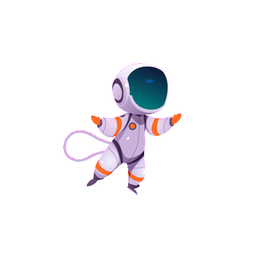
Lost in space?
The page you're looking for drifted off into the void. Let's get you back on course.
ERROR 404 • PAGE NOT FOUND
import {
    ErrorPage,
    ErrorPageErrorCode,
    ErrorPageHeading,
    ErrorPageDesc,
    ErrorPageIllustration,
    ErrorPageContent,
    ErrorPageSearch,
    ErrorPageFooter,
    ErrorPageLinks,
    ErrorPageIcons,
    ErrorPageErrorReference,
  } from '@ignix-ui/errorpage';

import { ButtonWithIcon } from '@ignix-ui/buttonwithicon';

<ErrorPage variant="default" className="bg-slate-950 relative overflow-hidden">
  {/* Space background with stars */}
  <div className="absolute inset-0 bg-slate-950">
    {Array.from({ length: 100 }).map((_, i) => (
      <div
        key={i}
        className="absolute rounded-full bg-white"
        style={{
          left: `${Math.random() * 100}%`,
          top: `${Math.random() * 100}%`,
          width: `${Math.random() * 2 + 1}px`,
          height: `${Math.random() * 2 + 1}px`,
          opacity: Math.random() * 0.8 + 0.2,
        }}
      />
    ))}
  </div>

  {/* Content */}
  <ErrorPageContent>
    {/* Error Code */}
    <ErrorPageErrorCode
      errorCode="404"
      animationType="bounce"
      className="text-center text-8xl sm:text-9xl lg:text-[12rem] font-bold text-primary mb-6 tracking-tight [text-shadow:0_0_20px_rgba(75,85,99,0.6),0_0_40px_rgba(75,85,99,0.35)] [filter:drop-shadow(0_10px_25px_rgba(0,0,0,0.3))]"
    />

    {/* Illustration - Astronaut GIF */}
    <ErrorPageIllustration
      illustration="/ignix-ui/img/error-astranaut.gif"
      className="w-64 h-64 mx-auto"
    />

    {/* Heading */}
    <ErrorPageHeading
      title="Lost in space?"
      className="text-white text-center text-4xl sm:text-5xl lg:text-6xl font-bold mb-4"
    />

    {/* Description */}
    <ErrorPageDesc
      description="The page you're looking for drifted off into the void. Let's get you back on course."
      className="text-center text-slate-300 mb-8 leading-relaxed text-lg"
    />

    {/* Search */}
    <ErrorPageSearch
      showSearch={true}
      searchPlaceholder="Search for something else..."
    />

    {/* Navigation Links */}
    <ErrorPageLinks>
      <ButtonWithIcon
        variant="default"
        size="lg"
        icon={<ArrowLeft/>}
        iconPosition="left"
        onClick={() => window.history.back()}
      >
        Go back
      </ButtonWithIcon>
      <ButtonWithIcon
        variant="default"
        size="lg"
        icon={<Home/>}
        iconPosition="left"
        onClick={() => (window.location.href = "/")}
      >
        Take me home
      </ButtonWithIcon>
    </ErrorPageLinks>
  </ErrorPageContent>

  {/* Footer */}
  <ErrorPageFooter>
    <p className="text-sm text-slate-400">ERROR 404 • PAGE NOT FOUND</p>
  </ErrorPageFooter>
</ErrorPage>
Installation
- CLI
- Manual
ignix add component errorPage
// ─────────────────────────────────────────────────────────────────────────────
// ErrorPage Component - Composable Error Page with Sub-components
// ─────────────────────────────────────────────────────────────────────────────
import * as React from "react";
import { motion } from "framer-motion";
import { Search, Copy, type LucideIcon } from "lucide-react";
import { cva, type VariantProps } from "class-variance-authority";
import { cn } from "../../../utils/cn";
import { Button } from "@ignix-ui/button";
import { Typography } from "@ignix-ui/typography";
import { ButtonWithIcon } from "@ignix-ui/buttonwithicon";
// ─────────────────────────────────────────────────────────────────────────────
// Types & Interfaces
// ─────────────────────────────────────────────────────────────────────────────
export interface ErrorPageProps
extends ErrorPageClassProps, VariantProps<typeof containerVariants> {
/** Custom background image URL */
backgroundImage?: string;
/** Icon to display throughout the page with continuous motion */
icon?: LucideIcon;
/** Custom color class for the icon (e.g., "text-blue-500", "text-white"). Defaults to white when backgroundImage is present */
iconColor?: string;
}
export interface ErrorPageClassProps {
children?: React.ReactNode;
className?: string;
}
export interface ErrorPageHeadingProps extends ErrorPageClassProps {
/** Main error title */
title?: string;
}
export interface ErrorPageDescProps extends ErrorPageClassProps {
/** Error description message */
description?: string;
}
export interface ErrorPageIllustrationProps extends ErrorPageClassProps {
/** Custom illustration - Can be React node, image URL, or component */
illustration?: React.ReactNode | string;
/** Illustration position */
position?: "left" | "right" | "topCenter";
}
export interface ErrorPageSearchProps extends ErrorPageClassProps {
/** Show search bar */
showSearch?: boolean;
/** Search placeholder text */
searchPlaceholder?: string;
/** Search handler */
onSearch?: (query: string) => void;
/** Search button text */
searchButtonText?: string;
}
export type ErrorPageIconItem = LucideIcon | [LucideIcon, string];
export interface ErrorPageIconsProps extends ErrorPageClassProps {
/** Array of 4 items. Supports two formats:
* - Basic: LucideIcon[] - icon components only, uses default colors
* - Tuple: [LucideIcon, string][] - [iconComponent, colorClass] for custom colors */
icons?: ErrorPageIconItem[];
}
export interface ErrorPageErrorReferenceProps extends ErrorPageClassProps {
/** Error reference ID to display */
errorReferenceId?: string;
/** Label text for the reference ID */
label?: string;
/** Helper text shown below the reference ID */
helperText?: string;
/** Callback when copy button is clicked */
onCopy?: (referenceId: string) => void;
/** Show copy button */
showCopyButton?: boolean;
/** Copy button text */
copyButtonText?: string;
}
export interface ErrorPageErrorCodeProps extends ErrorPageClassProps {
/** Error code to display */
errorCode?: string;
/** Animation type for the error code */
animationType?: "pulse" | "bounce" | "glow" | "shake" | "rotate" | "none";
/** Illustration to display above the error code (topCenter position) */
illustration?: React.ReactNode | string;
}
// ─────────────────────────────────────────────────────────────────────────────
// Variants
// ─────────────────────────────────────────────────────────────────────────────
const containerVariants = cva(
"min-h-screen w-full flex items-center justify-center",
{
variants: {
variant: {
default: "bg-gradient-to-br from-background via-muted/30 to-background",
minimal: "bg-background",
gradient:
"bg-gradient-to-br from-primary/5 via-secondary/5 to-primary/10",
dark: "bg-gradient-to-br from-slate-950 via-slate-900 to-slate-950",
},
},
defaultVariants: {
variant: "default",
},
},
);
const staggerContainer = {
initial: { opacity: 0 },
animate: {
opacity: 1,
transition: {
staggerChildren: 0.1,
delayChildren: 0.2,
},
},
};
const itemAnimation = {
initial: { opacity: 0, y: 20 },
animate: { opacity: 1, y: 0 },
};
const animationVariants = {
pulse: {
initial: { opacity: 1, scale: 1 },
animate: {
opacity: [1, 0.7, 1],
scale: [1, 1.05, 1],
},
transition: {
duration: 2,
repeat: Infinity,
ease: "easeInOut" as const,
},
},
bounce: {
initial: { y: 0 },
animate: {
y: [0, -10, 0],
},
transition: {
duration: 1.5,
repeat: Infinity,
ease: "easeInOut" as const,
},
},
glow: {
initial: { opacity: 1, filter: "brightness(1)" },
animate: {
opacity: [1, 0.8, 1],
filter: ["brightness(1)", "brightness(1.3)", "brightness(1)"],
},
transition: {
duration: 2,
repeat: Infinity,
ease: "easeInOut" as const,
},
},
shake: {
initial: { x: 0 },
animate: {
x: [0, -5, 5, -5, 5, 0],
},
transition: {
duration: 1,
repeat: Infinity,
ease: "easeInOut" as const,
},
},
rotate: {
initial: { rotate: 0 },
animate: {
rotate: [0, 5, -5, 5, -5, 0],
},
transition: {
duration: 2,
repeat: Infinity,
ease: "easeInOut" as const,
},
},
none: {
initial: {},
animate: {},
transition: {},
},
};
// ─────────────────────────────────────────────────────────────────────────────
// Illustration Renderer
// ─────────────────────────────────────────────────────────────────────────────
const renderIllustration = (
illustration: React.ReactNode | string | undefined,
): React.ReactNode => {
if (typeof illustration === "string") {
return (
<motion.div
className="relative"
initial={{ opacity: 0, scale: 0.9 }}
animate={{ opacity: 1, scale: 1 }}
transition={{ duration: 0.6 }}
>
<img
src={illustration}
alt="Error illustration"
className="max-w-full h-full"
/>
</motion.div>
);
}
return (
<motion.div
className="relative"
initial={{ opacity: 0, scale: 0.9 }}
animate={{ opacity: 1, scale: 1 }}
transition={{ duration: 0.6 }}
>
{illustration}
</motion.div>
);
};
// ─────────────────────────────────────────────────────────────────────────────
// ErrorPage Context
// ─────────────────────────────────────────────────────────────────────────────
const ErrorPageContext = React.createContext<{
variant?: "default" | "minimal" | "gradient" | "dark";
backgroundImage?: string;
}>({
variant: "default",
backgroundImage: undefined,
});
// ─────────────────────────────────────────────────────────────────────────────
// Main ErrorPage Component
// ─────────────────────────────────────────────────────────────────────────────
export const ErrorPage: React.FC<ErrorPageProps> = React.memo(
({
children,
variant = "default",
backgroundImage,
className,
icon: Icon,
iconColor,
}) => {
// For centered layout, separate illustration from content
const childrenArray = React.useMemo(
() => React.Children.toArray(children),
[children],
);
const illustrationChild = React.useMemo(
() =>
childrenArray.find(
(child) =>
React.isValidElement(child) && child.type === ErrorPageIllustration,
) as React.ReactElement<ErrorPageIllustrationProps> | undefined,
[childrenArray],
);
// Separate absolute positioned divs (backgrounds) from content
const backgroundChildren = React.useMemo(
() =>
childrenArray.filter((child) => {
if (
React.isValidElement(child) &&
typeof child.type === "string" &&
child.type === "div"
) {
const divElement = child as React.ReactElement<{
className?: string;
}>;
return (
typeof divElement.props?.className === "string" &&
divElement.props.className.includes("absolute")
);
}
return false;
}),
[childrenArray],
);
const contentChildren = React.useMemo(
() =>
childrenArray.filter((child) => {
if (!React.isValidElement(child)) return true;
if (child.type === ErrorPageIllustration) return false;
if (typeof child.type === "string" && child.type === "div") {
const divElement = child as React.ReactElement<{
className?: string;
}>;
return !(
typeof divElement.props?.className === "string" &&
divElement.props.className.includes("absolute")
);
}
return true;
}),
[childrenArray],
);
// Get illustration position (default to "left")
const illustrationPosition = React.useMemo(
() => illustrationChild?.props?.position || "left",
[illustrationChild],
);
const isRight = illustrationPosition === "right";
const isTopCenter = illustrationPosition === "topCenter";
const isDark = variant === "dark";
const backgroundStyle = React.useMemo(
() =>
backgroundImage
? {
backgroundImage: `url(${backgroundImage})`,
backgroundSize: "cover",
backgroundPosition: "center",
backgroundRepeat: "no-repeat",
}
: undefined,
[backgroundImage],
);
const contextValue = React.useMemo(
() => ({
variant: variant || "default",
backgroundImage,
}),
[variant, backgroundImage],
);
// Icon positions and sizes for continuous motion
const iconInstances = React.useMemo(() => {
if (!Icon) return [];
return [
{
size: 32,
positionClass: "top-[10%] left-[5%]",
delay: 0,
duration: 8,
},
{
size: 24,
positionClass: "top-[20%] right-[8%]",
delay: 1,
duration: 10,
},
{
size: 20,
positionClass: "top-[40%] left-[3%]",
delay: 2,
duration: 12,
},
{
size: 32,
positionClass: "bottom-[30%] right-[5%]",
delay: 0.5,
duration: 9,
},
{
size: 18,
positionClass: "bottom-[20%] left-[10%]",
delay: 1.5,
duration: 11,
},
{
size: 28,
positionClass: "top-[60%] right-[12%]",
delay: 2.5,
duration: 13,
},
{
size: 22,
positionClass: "bottom-[10%] right-[15%]",
delay: 3,
duration: 10,
},
{
size: 26,
positionClass: "top-[80%] left-[7%]",
delay: 1.2,
duration: 14,
},
];
}, [Icon]);
return (
<ErrorPageContext.Provider value={contextValue}>
<motion.div
className={cn(
containerVariants({ variant }),
className,
"relative overflow-hidden",
)}
role="main"
aria-label="Error page"
style={backgroundStyle}
>
{/* Background overlay for better text readability when background image is present */}
{backgroundImage && (
<div className="relative inset-0 bg-black/40 backdrop-blur-sm z-0" />
)}
{/* Animated icons throughout the page */}
{Icon &&
iconInstances.map((instance, index) => {
const iconColorClass = iconColor
? iconColor
: backgroundImage || isDark
? "text-white"
: "";
const opacityRange = iconColor
? [0.2, 0.5, 0.2]
: [0.1, 0.3, 0.1];
return (
<motion.div
key={index}
className={cn(
"absolute pointer-events-none z-0",
instance.positionClass,
iconColorClass,
)}
animate={{
rotate: [0, 360],
y: [0, -20, 0],
scale: [1, 1.1, 1],
opacity: opacityRange,
}}
transition={{
rotate: {
duration: instance.duration,
repeat: Infinity,
ease: "linear",
},
y: {
duration: instance.duration * 0.5,
repeat: Infinity,
ease: "easeInOut",
delay: instance.delay,
},
scale: {
duration: instance.duration * 0.7,
repeat: Infinity,
ease: "easeInOut",
delay: instance.delay,
},
opacity: {
duration: instance.duration * 0.6,
repeat: Infinity,
ease: "easeInOut",
delay: instance.delay,
},
}}
>
<Icon size={instance.size} />
</motion.div>
);
})}
{/* Render absolute positioned background elements */}
{backgroundChildren}
<div className="w-full max-w-9xl mx-auto px-4 sm:px-6 lg:px-8 py-12 lg:py-16 relative z-10">
{/* Illustration - Top Center (rendered outside flex container) */}
{illustrationChild && isTopCenter && (
<motion.div
className="flex items-center justify-center mb-8 lg:mb-12"
initial={{ opacity: 0, y: -20 }}
animate={{ opacity: 1, y: 0 }}
transition={{ duration: 0.6 }}
>
<div className="w-full max-w-xs sm:max-w-sm md:max-w-md lg:max-w-lg xl:max-w-xl">
{illustrationChild}
</div>
</motion.div>
)}
<motion.div
className={cn(
"flex flex-col lg:flex-row items-center justify-center gap-8 lg:gap-16",
isRight && "lg:flex-row-reverse",
)}
variants={staggerContainer}
initial="initial"
animate="animate"
>
{/* Illustration - Left/Right (rendered inside flex container) */}
{illustrationChild && !isTopCenter && (
<motion.div
className={cn(
"flex-shrink-0 w-full lg:w-auto flex items-center justify-center mb-8 lg:mb-0",
)}
initial={{ opacity: 0, y: -20 }}
animate={{ opacity: 1, y: 0 }}
transition={{ duration: 0.6 }}
>
<div className="w-full max-w-xs sm:max-w-sm md:max-w-md lg:max-w-lg xl:max-w-xl">
{illustrationChild}
</div>
</motion.div>
)}
{/* Content wrapper for non-illustration children */}
{contentChildren.length > 0 && (
<div className="flex-1 w-full max-w-xl space-y-2 text-center lg:text-left">
{contentChildren}
</div>
)}
</motion.div>
</div>
</motion.div>
</ErrorPageContext.Provider>
);
},
);
ErrorPage.displayName = "ErrorPage";
// ─────────────────────────────────────────────────────────────────────────────
// ErrorPageHead Component (Wrapper)
// ─────────────────────────────────────────────────────────────────────────────
export const ErrorPageHead: React.FC<ErrorPageClassProps> = React.memo(
({ children, className }) => {
return (
<motion.div
className={cn(
"flex-1 w-full max-w-xl space-y-2 text-center lg:text-left",
className,
)}
variants={itemAnimation}
>
{children}
</motion.div>
);
},
);
ErrorPageHead.displayName = "ErrorPageHead";
// ─────────────────────────────────────────────────────────────────────────────
// ErrorPageErrorCode Component
// ─────────────────────────────────────────────────────────────────────────────
export const ErrorPageErrorCode: React.FC<ErrorPageErrorCodeProps> = React.memo(
({
errorCode,
children,
className,
animationType = "none",
illustration,
}) => {
const { variant, backgroundImage } = React.useContext(ErrorPageContext);
const isDark = variant === "dark";
const hasBackgroundImage = !!backgroundImage;
const selectedAnimation = React.useMemo(
() => animationVariants[animationType],
[animationType],
);
const ariaLabel = React.useMemo(
() =>
`Error code ${errorCode || (children ? String(children).trim() : "404")}`,
[errorCode, children],
);
const textColorClass = React.useMemo(
() => (isDark || hasBackgroundImage ? "text-white" : "text-primary"),
[isDark, hasBackgroundImage],
);
const illustrationContent = React.useMemo(
() => (illustration ? renderIllustration(illustration) : null),
[illustration],
);
const errorCodeContent = (
<motion.div
initial={selectedAnimation.initial}
animate={selectedAnimation.animate}
transition={selectedAnimation.transition}
>
<Typography
variant="h1"
className={cn(
"text-center text-8xl sm:text-9xl lg:text-[12rem] font-bold mb-4 tracking-tight",
textColorClass,
className,
)}
aria-label={ariaLabel}
>
{children || errorCode || "404"}
</Typography>
</motion.div>
);
// If illustration is provided, render it above the error code (topCenter)
if (illustrationContent) {
return (
<div className="flex flex-col items-center">
<motion.div
className="mb-6 flex items-center justify-center"
initial={{ opacity: 0, y: -20 }}
animate={{ opacity: 1, y: 0 }}
transition={{ duration: 0.6 }}
>
<div className="w-full max-w-xs sm:max-w-sm md:max-w-md">
{illustrationContent}
</div>
</motion.div>
{errorCodeContent}
</div>
);
}
return errorCodeContent;
},
);
ErrorPageErrorCode.displayName = "ErrorPageErrorCode";
// ─────────────────────────────────────────────────────────────────────────────
// ErrorPageIcons Component
// ─────────────────────────────────────────────────────────────────────────────
const DEFAULT_ICON_COLORS = [
"text-red-500",
"text-blue-500",
"text-orange-500",
"text-purple-500",
];
const parseIconItem = (
item: ErrorPageIconItem | undefined,
index: number,
): { Icon: LucideIcon; color: string } | null => {
if (!item) return null;
if (Array.isArray(item)) {
const [IconComponent, colorClass] = item;
return {
Icon: IconComponent,
color:
typeof colorClass === "string" && colorClass.startsWith("text-")
? colorClass
: DEFAULT_ICON_COLORS[index],
};
}
return { Icon: item, color: DEFAULT_ICON_COLORS[index] };
};
export const ErrorPageIcons: React.FC<ErrorPageIconsProps> = React.memo(
({ icons, children, className }) => {
if (!icons || icons.length < 4) {
return <>{children}</>;
}
const parsed1 = parseIconItem(icons[0], 0);
const parsed2 = parseIconItem(icons[1], 1);
const parsed3 = parseIconItem(icons[2], 2);
const parsed4 = parseIconItem(icons[3], 3);
if (!parsed1 || !parsed2 || !parsed3 || !parsed4) {
return <>{children}</>;
}
const { Icon: Icon1, color: color1 } = parsed1;
const { Icon: Icon2, color: color2 } = parsed2;
const { Icon: Icon3, color: color3 } = parsed3;
const { Icon: Icon4, color: color4 } = parsed4;
const orbitRadius = 90;
const orbitIconSize = 28;
const iconSize = 42;
return (
<div className={cn("relative w-full py-2", className)}>
{/* Error Code / Children (e.g. ErrorPageErrorCode) */}
{children}
{/* Icon 1: Right side of "5" - On/Off animation */}
<motion.div
className={cn("absolute", color1)}
style={{
left: "calc(50% - 35%)",
top: "50%",
transform: "translateY(-50%)",
}}
animate={{ opacity: [1, 0.3, 1] }}
transition={{
duration: 1.5,
repeat: Infinity,
ease: "easeInOut",
}}
>
<Icon1 size={iconSize} />
</motion.div>
{/* Icons 2 & 3: Floating tools orbit around first "0" - like reference (Wrench top, Activity bottom with pulse) */}
<motion.div
className="absolute pointer-events-none"
style={{
left: "calc(50%)",
top: "50%",
width: `${orbitRadius * 2}px`,
height: `${orbitRadius * 2}px`,
marginLeft: `-${orbitRadius}px`,
marginTop: `-${orbitRadius}px`,
}}
animate={{ rotate: 360 }}
transition={{
duration: 10,
repeat: Infinity,
ease: "linear",
}}
>
<motion.div
className={cn("absolute", color2)}
style={{
left: "50%",
top: 0,
transform: "translateX(-50%)",
}}
animate={{ rotate: -360 }}
transition={{
duration: 10,
repeat: Infinity,
ease: "linear",
}}
>
<Icon2 size={orbitIconSize} />
</motion.div>
<motion.div
className={cn("absolute animate-pulse", color3)}
style={{
left: "50%",
bottom: 0,
transform: "translateX(-50%)",
}}
animate={{ rotate: -360 }}
transition={{
duration: 10,
repeat: Infinity,
ease: "linear",
}}
>
<Icon3 size={orbitIconSize} />
</motion.div>
</motion.div>
{/* Icon 4: Right side after 2nd "0" - On/Off + Up/Down linear motion */}
<div
className="absolute"
style={{
left: "calc(50% + 30%)",
top: "50%",
transform: "translate(-50%, -50%)",
}}
>
<motion.div
className={cn(color4)}
animate={{
opacity: [1, 0.3, 1],
y: [0, -12, 0],
}}
transition={{
duration: 2,
repeat: Infinity,
ease: "linear",
delay: 0.5,
}}
>
<Icon4 size={iconSize} />
</motion.div>
</div>
</div>
);
},
);
ErrorPageIcons.displayName = "ErrorPageIcons";
// ─────────────────────────────────────────────────────────────────────────────
// ErrorPageHeading Component
// ─────────────────────────────────────────────────────────────────────────────
export const ErrorPageHeading: React.FC<ErrorPageHeadingProps> = React.memo(
({ title, children, className }) => {
const { variant, backgroundImage } = React.useContext(ErrorPageContext);
const isDark = variant === "dark";
const hasBackgroundImage = !!backgroundImage;
const textColorClass = React.useMemo(
() => (isDark || hasBackgroundImage ? "text-white" : "text-primary"),
[isDark, hasBackgroundImage],
);
if (children) {
return (
<motion.div variants={itemAnimation}>
<Typography
variant="h2"
className={cn(
"text-center text-3xl sm:text-4xl lg:text-5xl font-bold mb-4",
textColorClass,
className,
)}
>
{children}
</Typography>
</motion.div>
);
}
return (
<motion.div variants={itemAnimation}>
<Typography
variant="h2"
className={cn(
"text-center text-3xl sm:text-4xl lg:text-5xl font-bold mb-4",
textColorClass,
className,
)}
>
{title || "Page Not Found"}
</Typography>
</motion.div>
);
},
);
ErrorPageHeading.displayName = "ErrorPageHeading";
// ─────────────────────────────────────────────────────────────────────────────
// ErrorPageDesc Component
// ─────────────────────────────────────────────────────────────────────────────
export const ErrorPageDesc: React.FC<ErrorPageDescProps> = React.memo(
({ description, children, className }) => {
const { variant, backgroundImage } = React.useContext(ErrorPageContext);
const isDark = variant === "dark";
const hasBackgroundImage = !!backgroundImage;
const textColorClass = React.useMemo(
() =>
isDark || hasBackgroundImage ? "text-white" : "text-muted-foreground",
[isDark, hasBackgroundImage],
);
if (children) {
return (
<motion.div variants={itemAnimation}>
<Typography
variant="body-large"
className={cn(
"text-center mb-8 leading-relaxed",
textColorClass,
className,
)}
>
{children}
</Typography>
</motion.div>
);
}
return (
<motion.div variants={itemAnimation}>
<Typography
variant="body-large"
className={cn(
"text-center mb-8 leading-relaxed",
textColorClass,
className,
)}
>
{description}
</Typography>
</motion.div>
);
},
);
ErrorPageDesc.displayName = "ErrorPageDesc";
// ─────────────────────────────────────────────────────────────────────────────
// ErrorPageIllustration Component
// ─────────────────────────────────────────────────────────────────────────────
export const ErrorPageIllustration: React.FC<ErrorPageIllustrationProps> =
React.memo(
({ illustration, position: _position = "left", children, className }) => {
const content = React.useMemo(
() => children || renderIllustration(illustration),
[children, illustration],
);
return (
<motion.div
className={cn("flex-shrink-0", className)}
initial={{ opacity: 0, scale: 0.9 }}
animate={{ opacity: 1, scale: 1 }}
transition={{ duration: 0.6, ease: "easeOut" }}
>
{content}
</motion.div>
);
},
);
ErrorPageIllustration.displayName = "ErrorPageIllustration";
// ─────────────────────────────────────────────────────────────────────────────
// ErrorPageContent Component
// ─────────────────────────────────────────────────────────────────────────────
export const ErrorPageContent: React.FC<ErrorPageClassProps> = React.memo(
({ children, className }) => {
return (
<motion.div
className={cn(
"flex-1 w-full max-w-xl space-y-2 text-center lg:text-left",
className,
)}
variants={itemAnimation}
>
{children}
</motion.div>
);
},
);
ErrorPageContent.displayName = "ErrorPageContent";
// ─────────────────────────────────────────────────────────────────────────────
// ErrorPageSearch Component
// ─────────────────────────────────────────────────────────────────────────────
export const ErrorPageSearch: React.FC<ErrorPageSearchProps> = React.memo(
({
showSearch = true,
searchPlaceholder = "Search for content...",
onSearch,
searchButtonText = "Search",
className,
}) => {
const [searchQuery, setSearchQuery] = React.useState("");
const handleSearch = React.useCallback(
(query: string) => {
setSearchQuery(query);
onSearch?.(query);
},
[onSearch],
);
const handleSearchSubmit = React.useCallback(() => {
onSearch?.(searchQuery);
}, [onSearch, searchQuery]);
const handleKeyDown = React.useCallback(
(e: React.KeyboardEvent<HTMLInputElement>) => {
if (e.key === "Enter") {
handleSearchSubmit();
}
},
[handleSearchSubmit],
);
if (!showSearch) return null;
return (
<motion.div variants={itemAnimation} className={cn("mb-6", className)}>
<div className="flex items-center gap-0 rounded-xl overflow-hidden border border-border/60 bg-background/90 backdrop-blur-sm shadow-sm focus-within:border-primary/60 focus-within:ring-2 focus-within:ring-primary/20 transition-all">
{/* Search Icon */}
<div className="pl-4 pr-2 flex items-center justify-center text-muted-foreground group-focus-within:text-primary transition-colors">
<Search className="h-5 w-5" />
</div>
{/* Input Field */}
<input
type="text"
placeholder={searchPlaceholder}
value={searchQuery}
onChange={(e) => handleSearch(e.target.value)}
onKeyDown={handleKeyDown}
className="flex-1 h-12 px-3 bg-transparent text-foreground placeholder:text-muted-foreground focus:outline-none text-base"
/>
{/* Search Button - Hidden on mobile */}
<Button
variant="default"
size="lg"
onClick={handleSearchSubmit}
className="hidden sm:block rounded-l-none h-12 px-6 bg-primary hover:bg-primary/90 text-white font-medium"
>
{searchButtonText}
</Button>
</div>
</motion.div>
);
},
);
ErrorPageSearch.displayName = "ErrorPageSearch";
// ─────────────────────────────────────────────────────────────────────────────
// ErrorPageFooter Component
// ─────────────────────────────────────────────────────────────────────────────
export const ErrorPageFooter: React.FC<ErrorPageClassProps> = React.memo(
({ children, className }) => {
const { backgroundImage } = React.useContext(ErrorPageContext);
if (!children) return null;
return (
<motion.div
variants={itemAnimation}
className={cn(
"text-sm pt-8 border-t border-border text-center",
backgroundImage ? "text-white border-white/20" : "text-slate-500",
className,
)}
>
{children}
</motion.div>
);
},
);
ErrorPageFooter.displayName = "ErrorPageFooter";
// ─────────────────────────────────────────────────────────────────────────────
// ErrorPageLinks Component
// ─────────────────────────────────────────────────────────────────────────────
export const ErrorPageLinks: React.FC<ErrorPageClassProps> = React.memo(
({ children, className }) => {
// If children are provided, render them directly (allows passing ButtonWithIcon components)
if (children) {
return (
<motion.div
variants={itemAnimation}
className={cn(
"flex gap-3 flex-row flex-wrap justify-center",
className,
)}
>
{React.Children.map(children, (child, index) => {
if (React.isValidElement(child)) {
// Clone the child to ensure it has a key
return React.cloneElement(child, { key: index });
}
return child;
})}
</motion.div>
);
}
},
);
ErrorPageLinks.displayName = "ErrorPageLinks";
// ─────────────────────────────────────────────────────────────────────────────
// ErrorPageErrorReference Component
// ─────────────────────────────────────────────────────────────────────────────
export const ErrorPageErrorReference: React.FC<ErrorPageErrorReferenceProps> =
React.memo(
({
errorReferenceId,
label = "Error Reference ID",
helperText = "Please include this ID when contacting support",
onCopy,
showCopyButton = true,
copyButtonText = "Copy",
className,
children,
}) => {
const { variant, backgroundImage } = React.useContext(ErrorPageContext);
const isDark = variant === "dark";
const hasBackgroundImage = !!backgroundImage;
const handleCopy = React.useCallback(() => {
if (errorReferenceId) {
if (navigator.clipboard && navigator.clipboard.writeText) {
navigator.clipboard
.writeText(errorReferenceId)
.then(() => {
onCopy?.(errorReferenceId);
})
.catch(() => {
onCopy?.(errorReferenceId);
});
} else {
onCopy?.(errorReferenceId);
}
}
}, [errorReferenceId, onCopy]);
// If children are provided, render them directly (allows custom implementation)
if (children) {
return (
<motion.div
variants={itemAnimation}
className={cn("mb-6", className)}
>
{children}
</motion.div>
);
}
// Don't render if no errorReferenceId is provided
if (!errorReferenceId) return null;
const containerBgClass = React.useMemo(
() =>
isDark || hasBackgroundImage
? "bg-slate-800/90 border-slate-700"
: "bg-slate-100 dark:bg-slate-800 border-slate-200 dark:border-slate-700",
[isDark, hasBackgroundImage],
);
const labelTextClass = React.useMemo(
() =>
isDark || hasBackgroundImage
? "text-slate-300"
: "text-slate-600 dark:text-slate-400",
[isDark, hasBackgroundImage],
);
const idTextClass = React.useMemo(
() =>
isDark || hasBackgroundImage
? "text-white"
: "text-slate-900 dark:text-slate-100",
[isDark, hasBackgroundImage],
);
const helperTextClass = React.useMemo(
() =>
isDark || hasBackgroundImage
? "text-slate-400"
: "text-slate-500 dark:text-slate-500",
[isDark, hasBackgroundImage],
);
return (
<motion.div variants={itemAnimation} className={cn("mb-6", className)}>
<div className={cn("p-4 rounded-lg border", containerBgClass)}>
<div className="flex items-center justify-between gap-4">
<div className="flex-1">
<p className={cn("text-sm font-medium mb-1", labelTextClass)}>
{label}
</p>
<p className={cn("text-base font-mono", idTextClass)}>
{errorReferenceId}
</p>
{helperText && (
<p className={cn("text-xs mt-1", helperTextClass)}>
{helperText}
</p>
)}
</div>
{showCopyButton && (
<ButtonWithIcon
variant="outline"
size="sm"
icon={<Copy className="h-3 w-3" />}
iconPosition="left"
onClick={handleCopy}
className={cn(
"shrink-0",
(isDark || hasBackgroundImage) &&
"border-slate-700 text-white hover:bg-slate-800",
)}
>
{copyButtonText}
</ButtonWithIcon>
)}
</div>
</div>
</motion.div>
);
},
);
ErrorPageErrorReference.displayName = "ErrorPageErrorReference";
Basic Usage
import {
  ErrorPage,
  ErrorPageContent,
  ErrorPageErrorCode,
  ErrorPageHeading,
  ErrorPageDesc,
  ErrorPageSearch,
  ErrorPageLinks,
  ErrorPageFooter,
  ErrorPageIcons,
  ErrorPageErrorReference,
} from '@ignix-ui/errorpage';
import { ButtonWithIcon } from '@ignix-ui/buttonwithicon';
import { Home, ArrowLeft } from 'lucide-react';

function NotFoundPage() {
  return (
    <ErrorPage variant="default">
      <ErrorPageContent>
        <ErrorPageErrorCode>404</ErrorPageErrorCode>
        <ErrorPageHeading>Page Not Found</ErrorPageHeading>
        <ErrorPageDesc>
          The page you're looking for doesn't exist.
        </ErrorPageDesc>
        <ErrorPageSearch />
        <ErrorPageLinks>
          <ButtonWithIcon
            variant="outline"
            icon={<ArrowLeft />}
            iconPosition="left"
            onClick={() => window.history.back()}
          >
            Go back
          </ButtonWithIcon>
          <ButtonWithIcon
            variant="default"
            icon={<Home />}
            iconPosition="left"
            onClick={() => (window.location.href = "/")}
          >
            Take me home
          </ButtonWithIcon>
        </ErrorPageLinks>
      </ErrorPageContent>
      <ErrorPageFooter>
        ERROR 404 · PAGE NOT FOUND
      </ErrorPageFooter>
    </ErrorPage>
  );
}
Props
ErrorPage
The main container component that wraps all error page content.
| Prop | Type | Default | Description |
|---|---|---|---|
variant | "default" | "minimal" | "gradient" | "dark" | "server" | "forbidden" | "default" | Visual variant of the error page |
backgroundImage | string | - | URL for background image |
icon | LucideIcon | - | Icon to display throughout the page with continuous motion |
iconColor | string | - | Custom color class for the icon (e.g., "text-blue-500", "text-white"). Defaults to white when backgroundImage is present |
className | string | - | Additional CSS classes |
children | ReactNode | - | Child components |
ErrorPageErrorCode
Displays the error code (e.g., 404, 500) with optional animations.
| Prop | Type | Default | Description |
|---|---|---|---|
errorCode | string | "404" | Error code to display |
animationType | "pulse" | "bounce" | "glow" | "shake" | "rotate" | "none" | "none" | Animation type for the error code |
illustration | ReactNode | string | - | Illustration to display above the error code (topCenter position) |
className | string | - | Additional CSS classes |
children | ReactNode | - | Custom content (overrides errorCode) |
ErrorPageHeading
Displays the main heading/title of the error page.
| Prop | Type | Default | Description |
|---|---|---|---|
title | string | "Page Not Found" | Heading text |
className | string | - | Additional CSS classes |
children | ReactNode | - | Custom content (overrides title) |
ErrorPageDesc
Displays the error description message.
| Prop | Type | Default | Description |
|---|---|---|---|
description | string | - | Description text |
className | string | - | Additional CSS classes |
children | ReactNode | - | Custom content (overrides description) |
ErrorPageIllustration
Displays an illustration (image, SVG, or custom React component).
| Prop | Type | Default | Description |
|---|---|---|---|
illustration | ReactNode | string | - | Illustration (URL string or React node) |
position | "left" | "right" | "topCenter" | "left" | Illustration position (responsive: top on mobile, side on desktop) |
className | string | - | Additional CSS classes |
children | ReactNode | - | Custom content (overrides illustration) |
ErrorPageSearch
Provides a search bar for users to search for content.
| Prop | Type | Default | Description |
|---|---|---|---|
showSearch | boolean | true | Show/hide search bar |
searchPlaceholder | string | "Search for content..." | Placeholder text |
onSearch | (query: string) => void | - | Search callback function |
searchButtonText | string | "Search" | Search button text |
className | string | - | Additional CSS classes |
ErrorPageLinks
Container for navigation links/buttons.
| Prop | Type | Default | Description |
|---|---|---|---|
className | string | - | Additional CSS classes |
children | ReactNode | - | Button components (typically ButtonWithIcon) |
ErrorPageContent
Wrapper for main content area.
| Prop | Type | Default | Description |
|---|---|---|---|
className | string | - | Additional CSS classes |
children | ReactNode | - | Content components |
ErrorPageHead
Alternative wrapper for header content (similar to ErrorPageContent).
| Prop | Type | Default | Description |
|---|---|---|---|
className | string | - | Additional CSS classes |
children | ReactNode | - | Header components |
ErrorPageFooter
Footer section for additional information.
| Prop | Type | Default | Description |
|---|---|---|---|
className | string | - | Additional CSS classes |
children | ReactNode | - | Footer content (renders only if children provided) |
ErrorPageIcons
Displays animated icons around the error code (typically used with 500 errors).
| Prop | Type | Default | Description |
|---|---|---|---|
icons | ErrorPageIconItem[] | - | Array of 4 items. Supports two formats: Basic: LucideIcon[] (icon components only, uses default colors) or Tuple: [LucideIcon, string][] ([iconComponent, colorClass] for custom colors) |
className | string | - | Additional CSS classes |
children | ReactNode | - | Error code component (typically ErrorPageErrorCode) |
ErrorPageErrorReference
Displays an error reference ID for support tracking (typically used with 500 errors).
| Prop | Type | Default | Description |
|---|---|---|---|
errorReferenceId | string | - | Error reference ID to display |
label | string | "Error Reference ID" | Label text for the reference ID |
helperText | string | "Please include this ID when contacting support" | Helper text shown below the reference ID |
onCopy | (referenceId: string) => void | - | Callback when copy button is clicked |
showCopyButton | boolean | true | Show copy button |
copyButtonText | string | "Copy" | Copy button text |
className | string | - | Additional CSS classes |
children | ReactNode | - | Custom content (overrides default implementation) |